
Imagine this, it's noon on a warm Sunday afternoon. You have just finished your homework for the day and turned on the TV. The familiar theme hits your ears and you see this on the screen:
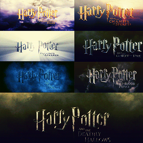
And you are back in your childhood.
The skewed buildings and cobblestones of Diagon Alley. The grand old castle of Hogwarts, the train, the magical creatures, and the world of Magic. Mysterious, epic, and endearing. Every detail lures you into a dreamscape of fantasy and fiction.
How does Typography weave the stories?
The sheer volume of graphical props used in the franchise could fill up a museum. And one aspect of this prop is the unique typefaces used.
Take, for example, the first thing that we remember: the logo in the movies. It was hand-illustrated by illustrator Mary GrandPré, who worked on the original book covers. It is a simple Gothic typeface (Cochin bold) arranged step-wise. The letter P was added later to represent the lightning bolt scar on Harry’s forehead.
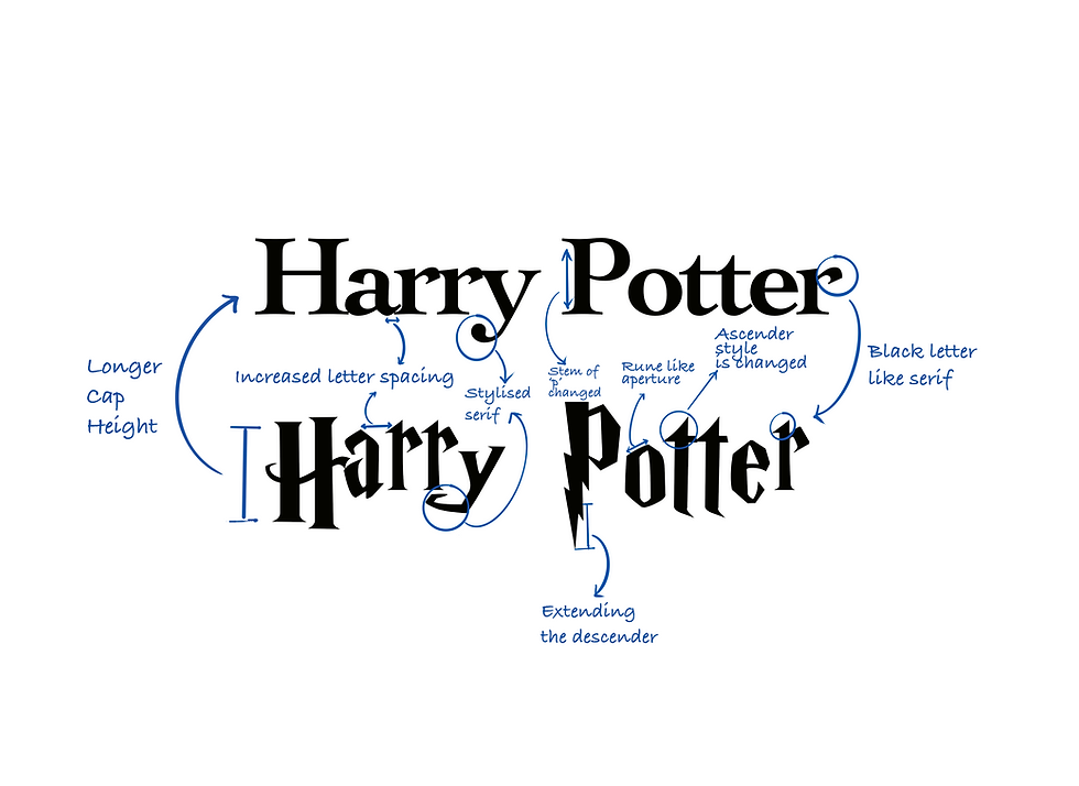
The two fonts presented represent a progression from a traditional serif typeface to a highly stylized, iconic design that embodies the “Harry Potter” franchise’s magical and adventurous themes. Here’s a breakdown:
Base Structure:
The second font appears to use the first font as a structural foundation. The overall weight, proportions, and spacing of the letters are consistent.
Stylistic Enhancements:
The design introduces Gothic-inspired elements, angularity, and decorative features to align with the magical, dark tone of the franchise.
The lightning bolt motif in the ‘P’ is a direct and iconic addition, immediately tying the design to Harry Potter’s character.
Contextual Evolution:
While the first font is neutral and functional, suitable for literature, the second font transforms this into an emblem of an eternal franchise, leveraging design elements to create a unique and memorable logo.
Notice how the letters have jagged edges and an uneven look to them. In font language, this would be referred to as a Blackletter. Thus serif would be a recurring theme throughout the all props we see. Regular rules of font typefaces are swapped and changed with
The Font Types
The unique typeface also appears in the various newspapers, posters, and book covers that appear throughout Harry Potter filmography. Most of the props have been designed by Miraphora Mina. A lot of them are posted on her website https://minalima.com/
However, the main typeface is derived from a quite famous breed of typefaces. They were first commercially made available under the name of “Antique,” when they were introduced by Vincent Figgins in 1815 to 1817. In spite of the initial explosion in their popularity, slab serifs suffered a decline as the century went on, primarily because they were competing with sans serifs, which were becoming more popular at the time.
In the Italienne model, also known as the French Clarendon type, the serifs are even heavier than the stems, forging a dramatic, attention-drawing effect. This is known as the reverse-contrast type. It is traditionally associated with use in the circus and other posters and is commonly seen in Western movies or to create a nineteenth-century atmosphere. It was most popular from the 1860s until the early twentieth century, particularly in the United States, although the basic concept originates from the London printing of the 1820s and it was used outside the United States.
The Paper
The Daily Prophet, the primary newspaper in the wizarding world, showcases a distinctive typographic style that evolves throughout the series:
• Early Films: In the initial installments, the newspaper features elaborate fonts with decorative initial letters, drawing inspiration from medieval ornamental alphabets. This design choice imparts a magical and old-world charm, aligning with the series’ setting. (The Rowling Library)
• Later Films: As the narrative progresses, the Daily Prophet transitions to a more uniform and text-heavy style, reflecting its role as a propaganda tool under the Ministry of Magic’s influence. This shift is achieved through the use of more rigid and less ornate fonts, symbolizing the oppressive atmosphere of the later films. (New Statesman)

The lack of a coherent structure stands out in these posters and newspapers. The newspapers appear as though they were artfully crafted by the delicate hands of children engaged in a whimsical endeavor.
Notice the different styled capital letters and strange kerning throughout the pages. The newspapers have a DIY feel to it.
The progression of typefaces employed in newspapers can be attributed to the advent of printing blocks and the necessity for swift news dissemination, which necessitated the adoption of simpler, less ornate typography. In the Wizarding World, the processes of printing, assembly, and distribution are almost effortless, newspapers are no longer constrained by these limitations.
Consequently, they can now incorporate a variety of typefaces, whimsical design elements, and even rotated text to enhance visual appeal.
The Quibbler

The Quibbler, known for its eccentric content, features playful and unconventional typography. The fonts used are often even more whimsical, with exaggerated serifs and unconventional letterforms, mirroring the magazine’s reputation for publishing odd and controversial stories. This typographic style visually communicates the publication’s quirky personality. (New Statesman)
The masthead often features playful, hand-drawn lettering with irregular baselines and varying stroke widths, conveying a sense of spontaneity and nonconformity. Headlines and article titles utilize a mix of bold, decorative fonts alongside more traditional serif and sans-serif typefaces, creating a visual juxtaposition that mirrors the magazine’s blend of fantastical content and serious journalism. This eclectic typographic approach not only captures the reader’s attention but also reinforces The Quibbler’s identity as a publication that challenges conventional norms and embraces the peculiar.
The Map of Hogwarts
Mina dug into their characters to design the map, rather than making it look like a treasure map or something more generic. Having flickering, animated, and handwritten lettering helped.
The Marauder’s Map is just one of the dozens of iconic magical objects to grace the Harry Potter universe, and we got to see its full power in The Prisoner of Azkaban. In week three of EW’s Binge of Harry Potter, Miraphora Mina and Eduardo Lima of the design team MinaLima sat down to discuss the details in making a simple piece of parchment unlock an entire world.
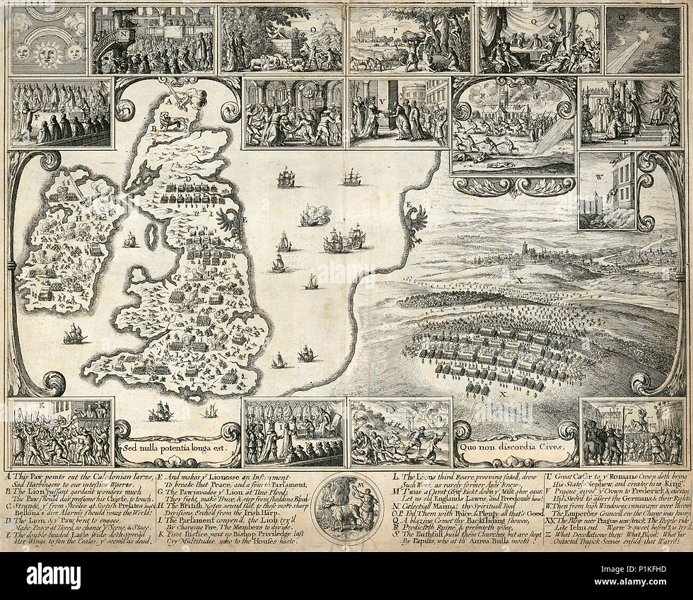
According to Miraphora Mina, they aimed for a more down-to-earth look for the Marauder's Map instead of the conventional fancy treasure map with burnt edges. The characters' cleverness and cunningness influenced the design choices.
Taking inspiration from illustrations made entirely out of words during the 17th and 18th centuries, the idea seemed fitting for mischievous characters like the ones in the film.
The map also reflects the unpredictable nature of Hogwarts itself, with its ever-changing staircases. Mina mentions that the map has flaps and layers that can be unfolded, adding an element of uncertainty as one navigates through it. The map's layout is rooted in the original drawings by production designer Stuart Craig, incorporating walls, windows, and shapes.
The text acts as the structural integrity of Hogwart’s many rooms and corridors. The layout came from original drawings made by production designer Stuart Craig when he was creating the school’s set.
The Books of Magic
Textbooks such as The Standard Book of Spells and Moste Potente Potions utilize traditional serif fonts, lending an air of authority and academic credibility. These typefaces are reminiscent of those found in classic literature and historical manuscripts, grounding the magical education in a sense of realism. (The RPF)
The attention to detail and the inclusion of easter eggs in props like The Daily Prophet and Snape's copy of Advanced Potion-Making showcase the care and thought put into creating the magical objects.
The pair’s way with words also made it into other props, like issues of The Daily Prophet, or Snape’s copy of Advanced Potion-Making. Most of the copy the audience sees isn’t just “blah blah blah” or a wall of Latin text.
Weasleys’ Wizard Wheezes
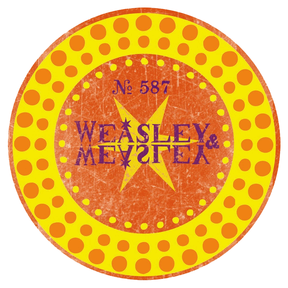
The Weasley twins’ joke shop, Weasleys’ Wizard Wheezes, boasts vibrant and exaggerated typography on its products and signage. The use of bold, playful fonts with dynamic shapes captures the whimsical and chaotic nature of their merchandise, appealing to the youthful and adventurous spirit of their customers. (Harry Potter)
Ministry of Magic Documents

Official documents from the Ministry of Magic feature clean, formal typography, utilizing sans-serif fonts that convey authority and bureaucracy. This typographic choice reflects the institution’s structured and hierarchical nature, contrasting with the more ornate and whimsical designs found elsewhere in the wizarding world. (The RPF)
The selected typefaces often exhibit a classic and timeless appearance, aligning with the Ministry’s longstanding presence in the wizarding society. This choice underscores the institution’s deep-rooted traditions and adherence to established norms.
Certain documents, such as proclamations and decrees, feature custom-designed lettering to convey significance and gravity. For instance, the “Educational Decree” posters introduced by Dolores Umbridge in “Harry Potter and the Order of the Phoenix” utilize bold, uppercase letters with decorative elements, emphasizing their authoritative nature.
Mischief Managed
The deliberate and thoughtful use of typography in the “Harry Potter” films extends beyond mere aesthetics; it serves as a narrative device that enriches the storytelling. By aligning typographic styles with the cultural and historical contexts of the wizarding world, the designers create a cohesive and immersive experience that resonates with audiences, enhancing the magical realism that defines the series.
Typography has shaped our world. It has formed the way we interact with information as human beings, as members of an evolved race. When we imagine the typography of an alternate world, what does it reveal bout that world, its people, its cultures, and its norms? More importantly, what does it reveal about us?


Comments